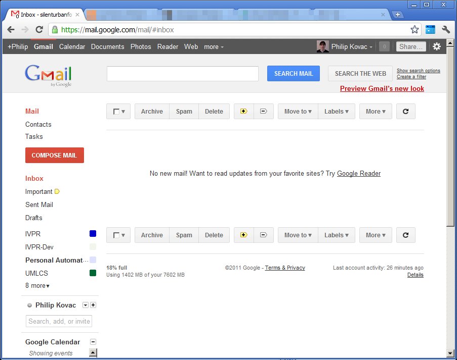

I'm really not too enthusiastic about GMail's "new look." Sure, from a visual design standpoint it's more consistent with Google's brand, and largely less visually jarring, but it does this at the cost of reducing the usability of the interface.
The color choices of the new interface are lower contrast and convey only slightly more information. The buttons for mailbox management are less prominent in the new design, moving to a dark-grey-on-light-grey scheme away from a strong black on manila coloration. The new buttons, honestly, look vaguely like they are inactive. I will admit an improvement, however, in that they now have on-hover effects to make it clear they are an interactive element.
The new design of GMail also eliminates some useful indicators of grouping and active/inactive elements. The new design uses coloration of the text (which has no obvious meaning aside from "look at me.") instead of a a clear association of the background of the label with the content area's border.
Additionally, dividers were almost entirely eradicated. There is no clear division between the labels, the content pane, and between the various modes and the labels. As a side effect of some of this, the mailbox management buttons are orphaned, floating in a white void with little to visually suggest them as a unified group. Though a mailbox with messages in it is somewhat differentiated by a different backdrop color, it still feels like too much is left implied.
I hope Google revisits some of the design decisions. Maybe lowering the border contrast and softening the buttons of the original would fix it, and removing some of the unnecessary padding.
No comments:
Post a Comment